A new decade is upon us and it may be time to throw out those old designs out the window. It is a new start for your business. With the change of date, why not change the look and feel of your website? Why not turn the page and start a new chapter in your digital journey?
If this proposition sounds interesting to you here are some ideas as to how you can change the design to make your website be more attractive, more responsive, more modern and basically evolving it to the next level.
Table of Contents
Bold Colours
Simple font
Animation
Break the layout walls
Smartphone prioritization
Age of Ultron
Storytelling
Videos
Social butterflies
Smart marketing
Call to Something fun
Old is gold, SEO
Suggestive Pop-up
Navigating the ocean of internet
Using Handwriting and drawings
Speed is of the essence
The background is where the true magic happens
A fitting image
Header and footer
The website is a canvas
1.Bold Colours
Source-https://www.pexels.com
Don’t get us wrong, using bold colours in no sense means turning your website into a Holi celebration poster. But using unconventional colour combinations that are catchy and not very often used. It can give your website the funky look it is missing to attract and engage the younger audience.
- Simple font
Believe it or not, the font is the most aspect of design. It is how the audience looks at what you have to say, quite literally. There are millions of free fonts out there that you feel look great. But bear in mind your own design. Some fonts may look awesome stand alone but in contrast to the overall design, it may look like the black sheep of the heard.
- Animation
Illustrations and animations are the things of the future. Adding a small animation, a swipe of the background or a GIF image can go a long way in engaging the audience. Though it may be simple enough to add with the current coding technology. The customer who is not very familiar with code can really appreciate the efforts you put in to make your website interactive.
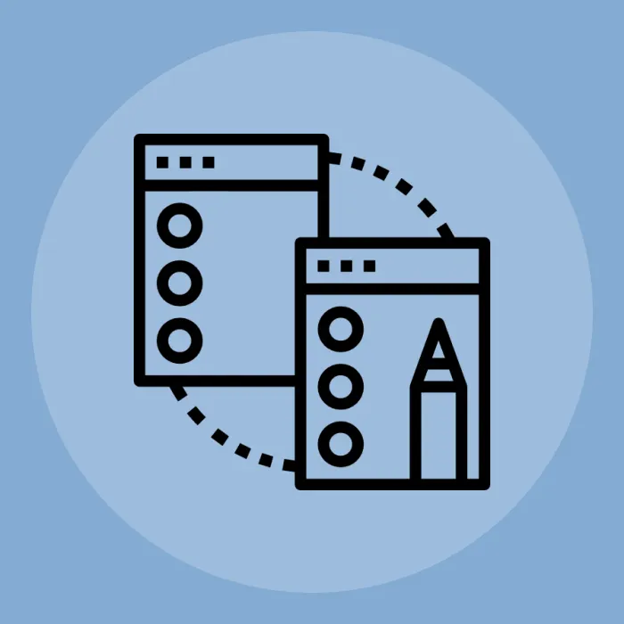
- Break the layout walls
You want to create something new and different? Then you need to let go of the idea of the same old basic layout of one column two-column. You need to think outside the box. But make sure not to get too carried away and create a modern art painting.
- Smartphone prioritization
It is no secret, the smartphone is the future of the digital industry. It may change to some other device in the future but for now, it is smartphones. You need to shift the orientation of the design to be more responsive. But it does not mean you should disregard the interface for the rest of the designs because customers are not just restricted to smartphones and may use other devices to access the website.
- Age of Ultron
Source-https://www.pexels.com
If you still did not get the reference. The use of Artificial intelligence can be very useful for the website. It can help you save lots of time and effort. To a certain extent cost as well. The use of chatbots and virtual assistants can help the users to navigate the website better.
It also helps you to reduce the burden on customer support as chatbots are more than equipped to answer the basic queries of the customers. Artificial intelligence can also be very useful in data sciences and evaluation. Giving an insight into customer behavior patterns and preferences.
Allowing you to know exactly what the customers liked or disliked and what changes would be most effective. Artificial intelligence is the diligent worker that works tirelessly towards the goal your organization was missing. Just ask Tony Stark.
- Storytelling
Your website is not just a piece of digital real estate on the internet but a children’s storybook. It should tell a story about your organization with maximum graphics and illustrations for a more vivid impression on the visitors.
It nudges the visitors to have a positive impact as it helps create a positive image. You are no longer a heartless cold corporate business that just wants to take the customer's money. But an organization that is working hard to get something of value to the customer. Which impression is better? It is totally up to you.
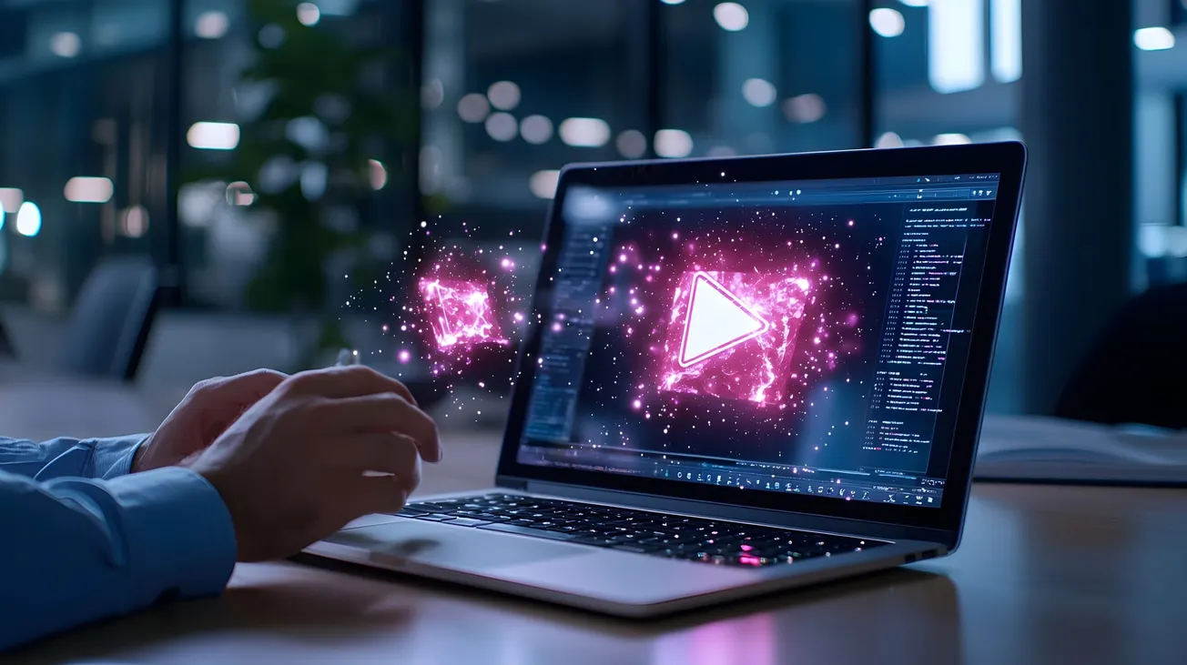
- Videos
Youtube is fairly famous these days and so is a video format for information. People don’t read instruction manuals these days, they youtube the instructions to follow along. So maybe try integrating a video on the front page, expressing the written content on your website.
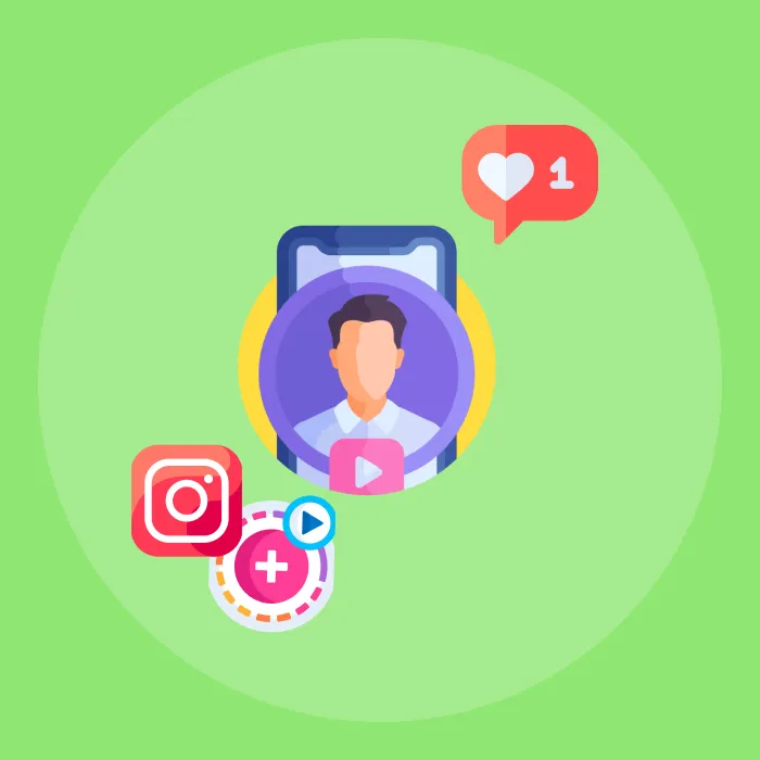
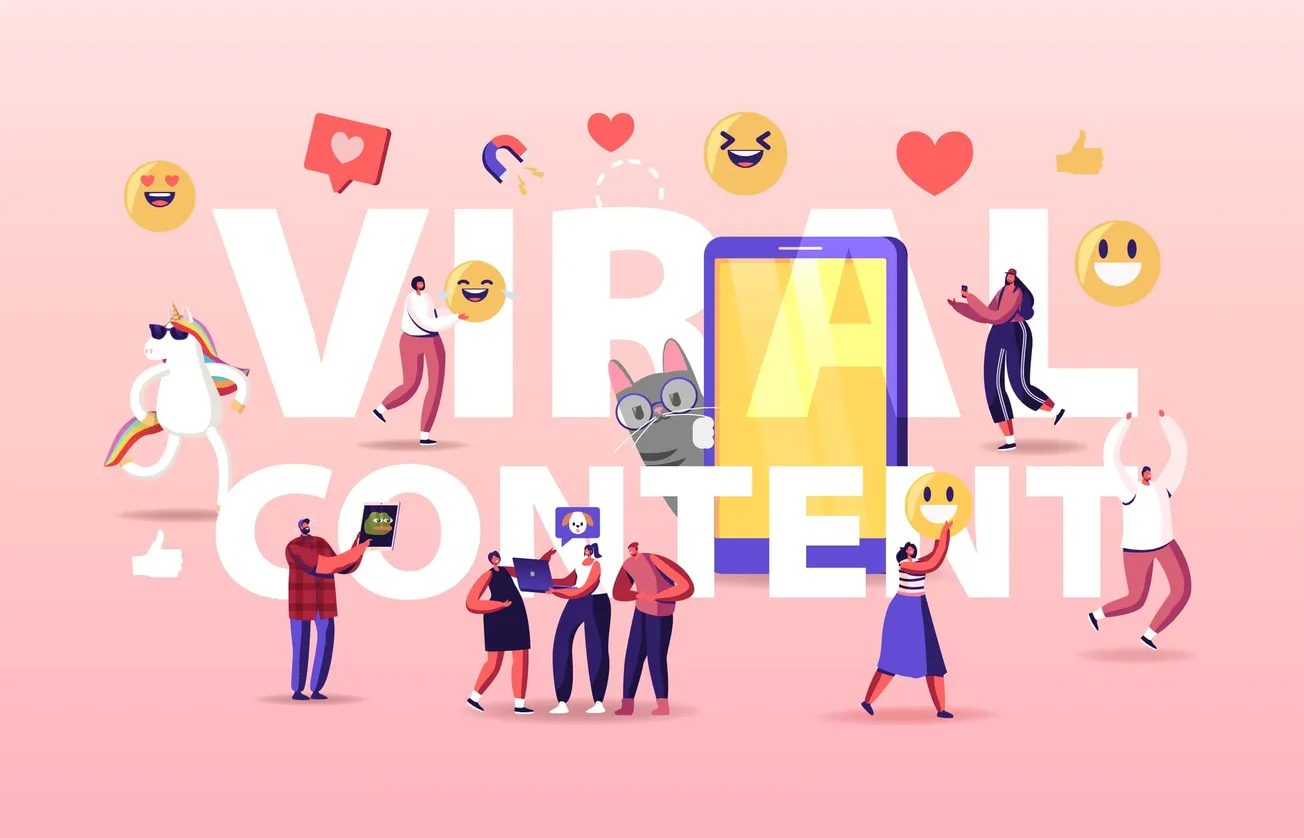
- Social butterflies
You are a fool if you think social media is irrelevant to your design. You need social media icons on the website in order to make it easier for your visitors to find you on the platforms. You should also have a live feed showing the latest comments and content form these social media platforms to get the user to generate content.
- Smart marketing
Source-https://www.pexels.com
Marketing as it is a tough business and hard work does pay off. But with the digital media on your side, you need to be smart with your efforts. Why run around in circles when you can place the right product at the right place reaping all the benefits without the effort?
- Call to Something fun
Source- founder magazine
You need to have a call to action. It is no surprise but you need to have the same old call to action is not a rule. Instead of using the same old formula of register here or sign up here. Why not try something new such as Sign up to get your free ebook or something that may interest the customer. You want a call to action that the customer wants to click on and not something that you want the customer to do.
- Old is gold, SEO
Although almost all the suggestions on this list are new or different in some way. SEO is an area that will always remain the same and of utmost importance. Make sure to optimize your content and graphics to get better search engine ratings. No matter how much you decorate your website. If it is not visible potential visitors all your efforts were for nothing.
- Suggestive Pop-up
Source-https://www.pexels.com
Pop-ups are everywhere and everyone uses it. But rather than throwing forceful sign ups, why not use it to suggest something of meaning to the customer. Such as a discount offer that the customer can avail with a limited period of time and so on. It will create a sense of urgency in the visitor and also help them get to know about the offer.
- Navigating the ocean of internet
Source-http://rollpark.us/
Optimize your navigation. With all the new design changes and ideas floating around. You don’t need your customers to lose sight of the main picture and be lost in the information you want them to see. Make sure your unique design has enough breadcrumbs for the visitors to follow their way back home.
- Using Handwriting and drawings
Nothing beats a human touch on the digital media. You can have handwritten or drawn content digitized and placed on the website to make it look more human. Something for the visitors to connect to.
- Speed is of the essence
The idea of a new design is good and effective in the long run. But it is also important to note that your loading speed should not falter under the pressure of expectations. Regardless of how the website looks, if it is slow it is useless.
- The background is where the true magic happens
Source-https://www.greenwoodcampbell.com/
A static background is boring. Why has it when you can have moving images and videos in the background to engage the visitors with its interactive design.
- A fitting image
Source-https://www.pexels.com
The images and their format are a persistent issue most website face while loading on various devices. Though the design may be responsive and adapts to various devices. Images sometimes do not match the expectations and fail to load or load all stretched out. Make sure to choose the right formate for the website to avoid future embarrassment.
- Header and footer
Headers and footers are like the Headlines and the show stopper of your website. You can have anything on there but need to reconsider as to how effective it will be in engaging the customer. Make sure you start Bold and finish smart so that the visitors are attracted easily and finish with a sense of accomplishment. Use the header to highlight the main attractions of the website and footer to emphasise how to contact you or why the customer should revisit.
- The website is a canvas
Source-https://mystaticself.com/
When it comes to designs and uniqueness. Thinking of the website as a canvas for an artist to draw on is the best metaphor you can use. It is a place where the designer can express the image of the organization on to the website and in doing so project what the organization symbolizes to the users.
But make sure you have some creative constraints, so as to not let the imagination run wild. A control group for the feedback on the design can also help you improve the design for the better.
Author: Kalpana Singh