
Sam Makad
Sam Makad is a business consultant. He helps small & medium enterprises to grow their businesses and overall ROI. You can follow Sam on Twitter, Facebook, and Linkedin.
Sam Makad / 6 Mins Read
Updated: December 27, 2024
Looking for cool website design ideas? This article has nine awesome examples to get your creativity flowing! Take a look.
It’s quite possible that the average user doesn’t give enough credit to web design. Even so, this doesn’t mean that they can’t appreciate a truly awesome website, whether or not they know exactly what went into making it. You can’t just focus on getting everything right; the best websites will push the boundaries of design and technology for something that’s an experience, more than just a platform.
Whether you’re a web designer yourself or you simply appreciate fabulous websites, the following examples are enough to impress anybody.
Take a look…
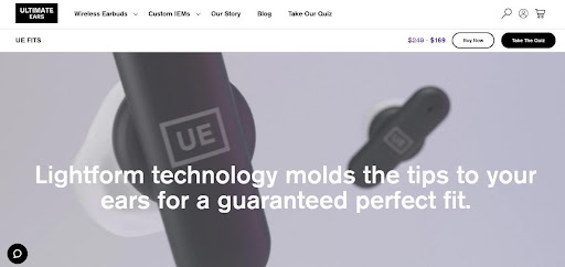
A website for small yet sophisticated earbuds, Revols focuses on the product with macro photography. Using larger-than-life photos means the user stays immersed in the site, and the muted, darker colors give everything a sleek look that says, “these aren’t just your average earbuds.” To round out the site, oversized fonts make bold statements to match the close-up product shots.
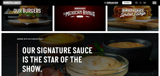
A UK-based restaurant chain, Burger & Sauce, uses the power of photography to sell expertly made hamburgers. And honestly, it’s easy to understand why their website stands out – one look at their featured burgers, and anyone’s mouth would start watering.
Over 80% of people decide what to order based on pictures alone, and this website capitalizes on that statistic. The power of food photography is real, and you can witness it working in real time on Burger & Sauce’s website. The burgers look rich and juicy, of course, but what really makes them pop is the dark background.
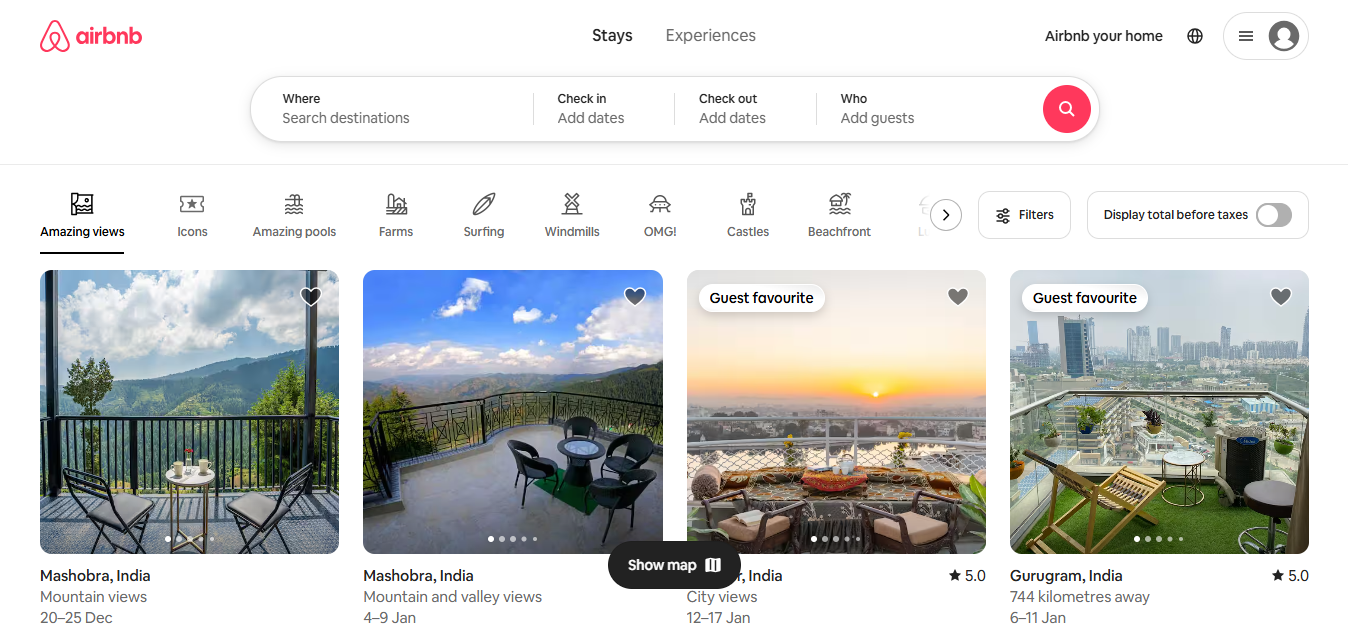
Airbnb’s homepage welcomes users with a destination and date search form, guiding them seamlessly to begin their booking journey. The navigation bar features vibrant icons that organize listings into clear, easy-to-navigate categories.
The design incorporates a smart search form that auto-fills the user’s previous search, reducing friction and enhancing usability. This approach is ideal for websites offering diverse products, as it provides a fast and reliable search experience. Adding an intuitive search bar with filter options helps users to quickly find exactly what they need.
Airbnb also uses high-quality imagery of rentals worldwide to create a sense of urgency and inspire travel planning. Engaging media elements, such as a strategically placed video above the navigation bar, capture attention and drive conversions.
This user-focused and visually appealing design has been pivotal in connecting with more customers, boosting bookings, and strengthening brand awareness.
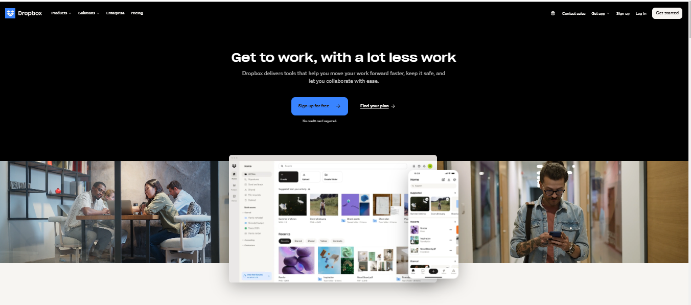
Dropbox’s website design is a great example of using visuals and simplicity to engage users. It features bold geometric shapes and slideshows showcasing what users can achieve with their product. Key features are listed in a clean, eye-catching layout, making it easy for visitors to grasp the product’s benefits at a glance.
The homepage doesn’t just inform—it guides. The navigation bar, standing out in white against the darker background, highlights clear call-to-action (CTA) buttons like "Sign up for free" and "Find your plan." This intuitive design helps users effortlessly take the next steps, boosting conversions.
These strategies work particularly well for complex, feature-rich websites like video conferencing apps. You can highlight essential features and encourage dynamic interactions by breaking down information into visually appealing, easy-to-digest sections. This approach ensures users stay engaged and understand your product’s value.
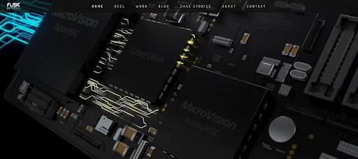
If your company creates animations, there’s no better way to show it off than by putting them on your website – and that’s precisely what Fuse Animation’s site does. Users don’t have to search for examples, though; a video on the home page starts playing as soon as you arrive.
Designed by WebCitz, the Fuse Animation site features their photorealistic 3-D animations to full effect. Aside from the introductory video, there are gratifyingly detailed background images of their work, but the site never feels crowded, thanks to ample white space between each photo element.
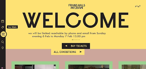
A Dutch museum (well, technically two museums with one website), the Frans Hals Museum website includes photographs of their displays, as you’d expect – but they frame everything within digital design elements. Taken together, the site guides visitors through the pages by directing their eyes across pictures, text, and call-to-action buttons.
One thing that sets this website apart from other museum sites is the color scheme. Most museums focus on colors that more or less match the aesthetic of their most popular exhibits, but Frans Hals uses a funky color palette of yellows, pinks, and greens that are almost pastel – but not quite. A tasteful amount of black lettering sharpens the effect, and you end up with a genuinely striking look.
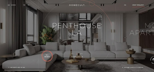
What should an interior design website look like? Homecult shows us the way with their uncluttered graphics and subtle animation effects as the user scrolls through the pages.
Visitors get the impression that these people know what they’re doing, and that isn’t just because of the sharp photos that showcase their work; it’s because the website is also expertly designed for a simple, intuitive experience. Their projects page lets the pictures do the talking but doesn’t leave users hanging; simply hover the pointer over any image for a few essential details or click for a more in-depth look.
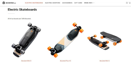
This website is a lesson in how to use color to sell products. First, consider the product itself: electronic skateboards. Many of the designs feature a blackboard with orange wheels.
Second, consider the website itself: gray tones and a white background keep things low-key, except for the bright orange “buy now” buttons. Now, the site design alone is pretty great, but the fact that they mirror their own products and it fit the site's purpose so well? Now, that’s a great web design.
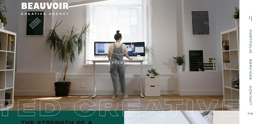
It’s especially important for creative agencies like Beauvoir to have an exceptional website – after all, how else will prospective clients be able to tell that they have what it takes? Well, Beauvoir certainly delivers. A bit of scrolling will take you further down the page, but what’s this? All of a sudden you’re scrolling horizontally instead of vertically!
Now that’s outside-the-lines thinking. Users can also find sidebar menus instead of the traditional top-of-the-page menus, adding to the unconventional aesthetic. Large, almost overstated text projects confidence while keeping the brand message brief, and fully saturated pictures and videos inspire the imagination.
A digital design/branding agency, Buero112 tells a story in predominantly black, white, and gray – but not completely. The monochrome color scheme is broken up by the occasional line of text in a contrasting color or a full-color photograph to delight the user’s eyes. By and large, however, the site sticks to an almost stark black-and-white theme.
As the user arrives on the home page, they don’t have to start exploring on their own – the site immediately starts playing an embedded video that tells the brand's story. One cool detail is the pointer. It appears as a dot within a circle rather than an arrow and responds to user movement with a slight “drag” effect for a more immersive experience.
These are just a few examples; there are plenty more to find!
Nobody visits a website purely to explore it, but it certainly doesn’t hurt when browsing a site feels like an experience in and of itself. That’s when you know you’ve got a winner on your hands – when not just the product or message but the website itself sticks in your mind as an amazing discovery.
You’ll also receive some of our best posts today


Sam Makad is a business consultant. He helps small & medium enterprises to grow their businesses and overall ROI. You can follow Sam on Twitter, Facebook, and Linkedin.