Creating a customer-friendly landing page isn’t exactly rocket science. Yet, few website owners and marketers leverage proven tactics to enhance customer experience. That’s because enhancing customer experience requires research, experimentation, and monitoring.
It’s more than just running with what looks good or appears easy to navigate. But there are a few basic elements used by most successful websites that you can blindly include on yours. So, what are these elements? Let’s find out, alongside some examples of their application.
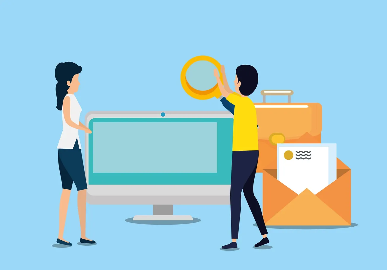
Before we delve into the elements, let’s understand what qualifies as a landing page, so you can maximize your opportunities to engage customers.
What is a landing page?
A landing page is a web page that a customer reaches after having expressed interest in your brand through one of the following ways.
A search engine query
A social media ad
An email link
Print or TV ads
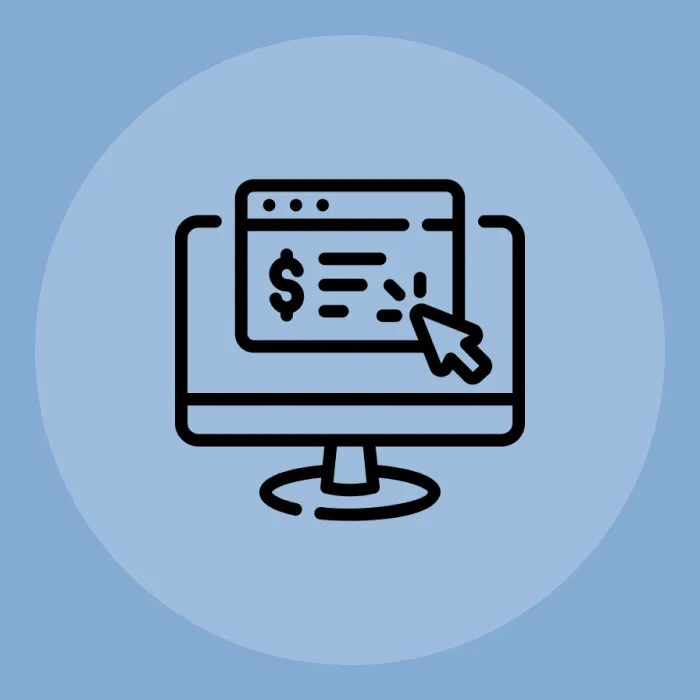
Technically, a landing page is built to elaborate the message conveyed through the ad or source of traffic. The landing page’s goal is to convince and convert its visitor to perform some specific action.
The method the page uses to achieve its goal varies, depending on the campaign and type of landing page.
What are the types of landing pages?
Classified by their purpose, landing pages typically occur in seven different forms. Here are the seven major types of landing pages that you could create.
Landing pages that capture leads
Any landing page built to coax visitors into sharing personal data can be classified as a lead capture landing page. Typically, such pages are created to capture names and email addresses and have no exit or navigation buttons.
Recommended: Little Sneaky Secrets To Optimize Landing Page
Sometimes, such pages offer incentives to encourage visitors to share personal information. These incentives could be product discounts, free webinars or eBooks. Details captured by such pages are typically used to build email lists.
Click-through landing pages
This landing page exists solely to compel people to complete a purchase. Containing information about offers or benefits of the purchase, this landing page is typically placed between a product description page and the checkout page. All a visitor can do on such a page is read about the purchase and click through to reach the point of purchase.
Home page landing pages
The home page usually has the lowest conversion rate compared to other landing pages. This is because it tends to be lazy and unfocused. Why? You can’t make hard sells on the homepage landing page. Doing so would violate internet etiquette. And home pages typically have way too many distractions to make massive conversions.
What’s more, you can’t accurately figure out why someone abandoned your intended conversion path from the home page. The irony in marketing is that so many experts waste valuable resources on driving traffic to the home page.
Product detail landing pages
A common page on retail and SaaS (Software as a Service) websites, the product detail page simply lists features and other information about a product. Sometimes, such pages also feature ratings and reviews and offers if any.
The advantage of the product detail landing page is that it’s self-sufficient and requires no support from any other page. But the product page, much like other web pages, can have distractions present across your website, affecting customer conversion rates.
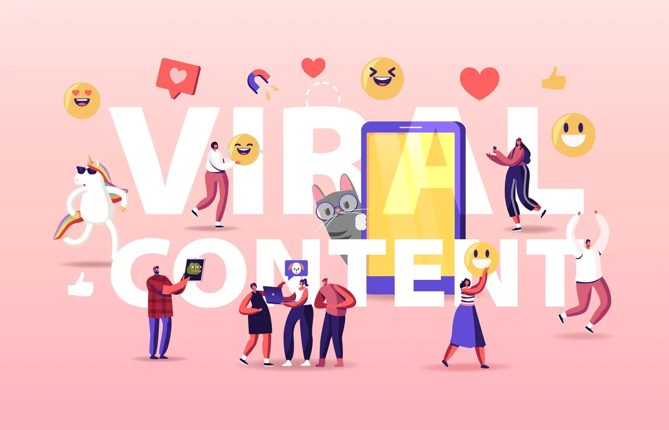
Viral landing pages
In today’s age, going viral is a goal many online businesses chase. To make this goal a reality, many of these companies invest heavily in creating flash games or videos that are super share-worthy.
The goal of a viral landing page is to feature such content with subtle branding in the background. The branding could be a logo, a “powered by” reference, or an indirect reference to the brand within the game or video content.
Infomercial landing pages
If the landing page that you are creating includes excitable language that you can imagine being read with exclamation marks, it is an infomercial landing page. Typically extra long, this page involves a lot of scrolling by getting customers to stay engaged and take a journey with you through your message.
The lower a customer goes on an infomercial page, the more deeply into the sales pitch he or she tends to fall. The goal with such a page is to create interest and a certain commitment in a potential customer to keep scrolling until the end.
Microsites
Used by the fairly big brand for large campaigns, microsites are complete supplementary websites with unique URLs and campaign-related messaging. Although microsites can have more than one page, they are referred to as landing pages because they host website traffic driven through online ads and other such sources. The most common example of a microsite is a movie trailer website, which is created solely to promote a movie for a fixed period of time.
7 effective landing page elements to enhance customer experience
Any business can benefit from a high-converting landing page. And the best landing pages have these crucial elements.
- Incremental changes
Before working on any landing page changes, note that your conversions could drop by as much as 20% if you implement a complete design change. Ideally, make small changes and A/B test them all before keeping them permanently. It’s even better if you use a website analytics tool such as Hotjar to study how your website is being used to make decisions on any changes.
- Directional Cues
Since your visitors have to navigate the website by themselves, you may want to leave directional cues for them to follow. Some studies show that focus levels can as much as double when directional cues are being used. You can test blatant cues and subtle ones before deciding which one is best suited for your purpose. The answer to this depends on the type of campaign and landing page being created.
- Social proof
Further down this post, you’ll discover how a simple screenshot of happy customers could make a significant difference in your conversion rate. Social proof has driven decision online and offline and will continue to do so. Experiment with simple one-line remarks made by clients and video testimonials before choosing the type of social proof that suits your website best.
- Self-serve
Even if you have the best landing page ever, visitors are likely to face hiccups. You can eliminate loss of conversions due to this by making support self-service on your website. Consider using a chatbot meets video calling tool to enable an unfailing support system. Even brands as large as Samsung have begun to use this technology to delight their customers.
- Killer Headline
As you’ll learn in the examples section of this post, the best landing pages have a killer, compelling headline. Why should customers give you any attention at all? Answer this powerfully and in brief, and you will have your conversion rate skyrocket. The key to creating the perfect headline is understanding an area where your product/service truly excels and advertising that fact in the headline.
- The right color scheme/fonts
Although this post focuses deeply on content, you should know that design is equally if not far more important. The right color scheme and fonts can make or break your success. Some fonts are more likely to be noticed by your audience and registered in their minds. You can discover such facts by testing colors and fonts on your landing pages and tracking conversions. But remember, don’t stray far away from your brand colors and chosen font.
- Relevance
This goes without saying. If your landing page is not relevant, you will lose all the traffic that you have worked hard to earn. A landing page is like the light at the end of the tunnel and your target audience will expect to see exactly what they’re looking for at the end of that tunnel. Check if your messaging and offerings are consistent across your ads and your landing pages to enhance customer experience and conversions.
Examples of killer landing pages (& other insights that you can use)
Apart from the landing page elements discussed above, there are a few other common aspects of successful landing pages. You can learn more about them through these brilliantly designed landing pages.
- Geico
Notice the one field form, custom CTA button, and unique value proposition. Sometimes, the best landing pages are extremely simple. They don’t display any extra information, focusing only on the task at hand, which in this case is collecting the visitor’s Zip Code. So, when creating a landing page, ask yourself - what is the primary goal? What is a powerful way to drive it?
In short, here’s what you can take away from this landing page -
Create a clear, simple value proposition.
Use as few fields on a form as possible.
Customize your CTA button to make the call more compelling.
- Hired
When you look at this landing page, what speaks to you first? Well, it’s the value proposition, of course. What are you offering customers? Have you asked yourself this question? Because that’s what customers first ask when they visit your website.
Hired makes the value proposition clear and compelling using the line ‘Reach 4000+ Companies At Once’. A number in the value proposition makes for a nice touch.
In short, here’s what you can take away from this landing page -
Use an impressive number in your value proposition if possible.
Spend all your copy space on lines that can convince potential customers.
Use a minimalistic design with only the most important form fields.
- Indeed Crowd
If your landing page is focused on an activity such as referring, you have to give customers a powerful reason to participate in it. Why should customers help fuel your referral system? That’s what your first copy line should ideally address.
Indeed does it well, by saying ‘Get paid for referring the perfect candidate’. When you’re asking people to do something, it’s also useful to show them how easy it is. You’ll want to show customers how the activity is low-investment, high-returns.
In short, here’s what you can take away from this landing page -
Encourage page visitors to participate by clearly stating benefits.
Ensure you clarify ease of participation to make the decision easier for page visitors.
Minimize the number of fields used to improve your conversion rate.
- More Clients More Results
This website has used the first person in the headline deliberately to make it more effective. The checklist of benefits and green ticks also make the message more effective. This landing page also features a screenshot with the image of happy customers, which can have a compelling effect on potential customers. Plus, the bright orange CTA button is designed to drive more conversions.
In short, here’s what you can take away from this landing page -
Complement a strong CTA with a bright color on the CTA button.
Use positive reinforcement through suggestive icons such as tick marks and underlines.
Ensure that your product description is clear and convincing.
- Mint.com
With an attention span of around 8 seconds, humans need all the visual suggestions that they can get to stay focused on anything. Mint.com uses that information by supporting their copy with strong, instructional visuals. The step by step text segments and arrow marks make the landing page super effective. You could apply this tactic when working with complicated concepts.
In short, here’s what you can take away from this landing page -
Ensure that you use white space alongside strong, instructional visuals to direct a visitor’s attention through your conversion path.
The orange CTA button clearly stands out against the text in the background.
The landing page is also easily scrollable, making it more effortless for website visitors to follow your intended path.
The right elements and strategies can help create a super effective landing page. The elements discussed in this post are among the most common ones that work for most businesses. So, what are you waiting for? Get started on optimizing your landing pages. Remember to test everything that you create!