Looking for ways to optimize your conversion rate is a task that is never truly over. And making sure your landing page is as good as it can be is an important step in that process.
Bad landing pages. They are everywhere, and if you have been around the web long enough, chances are you can get a feeling for whether or not a landing page will be a rough ride before you’ve even read what’s written on it.
This issue arises because, just like a good joke, a great landing page is deceptively simple. The careful work that goes into crafting such a page only becomes apparent when someone stops to analyze them; to pick apart the details of what makes them work. And even then, the quality of a landing page is often context-dependent — what works for one brand may not work for another.
These layers of complexity can make it difficult to put together a great landing page. Luckily, while there are no hard and fast rules for what makes a great landing page, there are principles you can follow to facilitate the process. Here are some guiding principles that can help you create a great landing page, or elevate your existing ones.
1. Stick to relevant web design
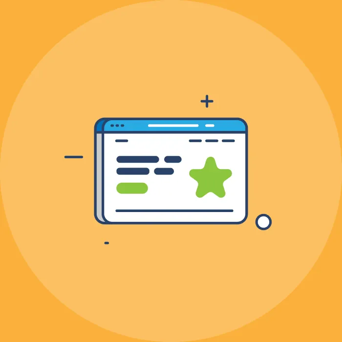
The visual and design elements of your landing page tell a story, and that story should match what your landing page is trying to say. Now that sounds vague, so let’s take a look at an example. Here’s a landing template example with the text blacked out.
What adjectives can be used to describe that landing page? Opinions on that may vary, but most people would pick variations on the world serious and professional. It’s a business landing page for serious people, and that is reinforced by the sample text used by the creator of the template.
The effectiveness of a landing page can be greatly boosted by making sure the web design is relevant to the message. It makes it easier for first-time visitors to figure out your landing page, which is important because you don’t have a lot of time to get new visitors engaged.
According to a 2011 report published by the Nielsen Norman Group, the average web user leaves a website in less than 20 seconds. That’s how long you have to get across what your business is about and what its value proposition is. And having the web design agree with your business proposition helps you get the most out of those 20 seconds. If users can tell right away what type of business yours is, they can focus on figuring out your value proposition.
Figuring out how to make a landing page relevant to your business comes down to using the right fonts, colors, visual elements, and more. Setting the right tone is tricky, but you can make your life easier by choosing a template that was designed with your niche in mind. This guide is a good example — most of the free templates listed there list what types of businesses they are best suited for.
2. Make simplicity a priority
Again, this goes back to the limited time you have to leave an impression on a customer. Your landing page — or at least the first screen of your landing page — should have as little information as possible while still being effective. This allows visitors to quickly scan the page and figure out whether they want to engage with the call to action or not.
Of course, figuring out what “as little as possible” means in the context of different businesses is not a straightforward process. Let’s use the landing page we showed in the previous image as an example. Here’s what the text of that page said:
“Most calendars are designed for teams. Slate is designed for freelancers who want a simple way to plan their schedule.”
And the title above that text says “Work at the speed of thought.” Everything is clear and concise, and it conveys what the product is, who it is for, and how it is different from the competition with a remarkable economy of words. Below that there are two simple calls to action, where visitors are invited to either try the app for free or learn more about it.
There are other ways to put simple yet effective landing pages together, and you can try different things as long as the final result is a landing page that tells visitors why they should stay within 20 to 30 seconds. It’s also a good idea to take a peek at what your competition is doing for inspiration.
3. Get quality assets
This should go without saying, but if your landing page looks cheap, it won’t cause a great first impression. And one of the fastest ways to cheapen a landing page is to use low-quality assets. A boring picture or poorly-edited video may very well do more harm than good, and even the best pieces of written copy can sound amateurish if they make it to your landing page filled with typos. This is also an issue when you use a template style that is overused or visually bland.
Compare these two template examples:
The second one is not perfect, but it is much more visually appealing. And it would provide a stronger foundation to build your landing page upon, especially if you are willing to hire graphic designers to draft original assets for your landing page.
It is worth noting that quality assets don’t have to cost a lot. You can get stock photos and videos all over the web and available for a low price, sometimes free. And while you get what you pay for when it comes to copywriting, you can keep costs low by just limiting how much writing you include on the landing page. Most writers charge per word, after all.
Make sure to keep the simplicity principle in mind. It can be tempting to use an excellent asset just because you have it and it looks good on its own. However, sometimes less is more, and a landing page is a tool above all. Anything that doesn’t make it better at turning visitors into customers should be removed.
4. Leverage social proof
Social proof plays off a basic human instinct. When you are in a situation and you are not sure what to do, what’s the best move? Well, more often than not, the answer is to do what everyone else is doing. After all, if everyone else is doing X with no problem, it should be safe for you to do X as well.
The importance of social proof is accentuated in the online world, where there is a general lack of signals to pick up on. When walking into a physical store, you can get a sense of how respectable the establishment is by judging aspects such as cleanliness, organization, staff behavior, whether or not there are other customers there, whether or not the store is on the bad side of town, etc.
A landing page lacks all of that context, and that lack of context makes social proof even more powerful. It should come as no surprise that a 2021 Bizrate Insights survey found that 91% of consumers read at least one online review before making a purchase online.
Social proof is generally more effective if you tailor it to what matters the most to your audience. Positive reviews are a great way to engage a regular audience, while an audience of professionals may be more interested in the companies your business has helped in the past. You can see an example of the latter on the Lachi Media website; they are a digital marketing agency for nonprofits.
5. Keep optimizing in it
Have you ever heard of the ninety-ninety rule? It’s a semi-humorous aphorism first stated in the 80s by computer scientist Tom Cargill. It states: “The first 90 percent of the code accounts for the first 90 percent of the development time. The remaining 10 percent of the code accounts for the other 90 percent of the development time”.
It’s just hard to finish and perfect things. And in the case of a landing page, your work may never be truly done. It’ll need to be tweaked not only as mistakes and issues are found, but also as the realities of your business model and marketing strategy change. Make sure not to treat your landing page as a “set it and forget it” passive system. Keep checking it, auditing it with different tools, and running A/B tests with landing page variations to make sure it remains effective.
Conclusion
There are two main things you should take away from this guide. The first is, of course, that creating a great landing page is more difficult than it seems. However, the second takeaway should be that a landing page doesn’t have to be boring.
Take a look at any list of the greatest landing pages of all time. You will find plenty of ideas that will stick with you or make you smile. And while you should not try to make your landing page different for the sake of difference alone, focusing on making a landing page you’d actually enjoy visiting is not a bad idea.

