If there’s one consistent advice that every marketer will give you, it’s to increase your website traffic. While you can benefit from growing visits to your website, what good are those extra views if no one is really interacting with your content?
The answer? It’s pointless. Picture this. You invest seven months in creating the ultimate rap piece in Russian, but then you realize that the gig you booked will have people who don’t understand the language. That’s what will happen to a website with high traffic but no website optimization.
The goal of increasing website visits is worth chasing only if you can convert those visits into something tangible - sign-ups, inquiries or sales. That’s why what’s truly important is learning how to optimize your website and delight online visitors.
This post explores website optimization tricks, which you can use to keep your online visitors engaged and interested.
Website optimization statistics and facts
Before we get into solid tricks for website optimization, let’s explore a few statistics that can directly translate into ideas for you to instantly optimize your website for more conversions.
- Unlike popular belief, long landing pages are 220% more effective than those with a CTA (Call To Action) in the top half. So, when running landing page tests, consider experimenting with longer landing pages.
- 61% of the companies that participated in this study claimed they ran 5 or less landing page tests in a month. If your company isn’t running landing page tests, you are likely missing out on a substantial amount of conversions.
- 42% of the graphics depicting offers on landing pages aren’t linked to their source. It’s silly mistakes like this that can cost you valuable conversions. You can avoid them by scanning a checklist every time you publish a landing page.
- Tools used for conversion rate optimization have 223% ROI. Consider investing in them to improve your existing conversion rate and analyze weaknesses in your landing page strategies.
- Using video content on landing pages could increase your conversions by as much as 80%. Consider this when designing your home page and important landing pages such as event registration pages, your checkout page, and feedback pages.
Good websites follow the basic laws of conversion optimization, which you can ascertain by studying them and following them for inspiration. The next section on this post focuses on examples of good websites and what you can learn from them.
Examples of good websites (& what you can learn from them)
As the old saying goes, you never get a second chance to make a first impression. That’s why it’s critical to focus on website optimization and engage your audience in the first go. Choosing your website design and content can be tricky, which is why I have put together this section with examples that you can use for inspiration. Here goes.
1. AirBnb
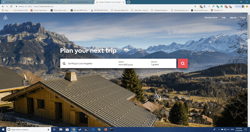
If there’s a way to powerfully communicate your business in four words to your audience, you should choose that way. AirBnB’s website is great for many reasons. It’s minimalistic, clear, hard-hitting and has a great, high-definition background image. Here are a few more reasons why AirBnb got it right.
- The homepage has a destination and date search that most people come looking for right up in front.
- The search form automatically fills-in users’ previous data, making it smart and effortless - two things that website visitors love.
- The primary CTA stands out from the background but also complements it. The secondary CTA is also visible above the fold to website visitors.
- The website displays offer on the same page where booking can be made. They also show which offers are most used by other customers.
2. The Boring Company
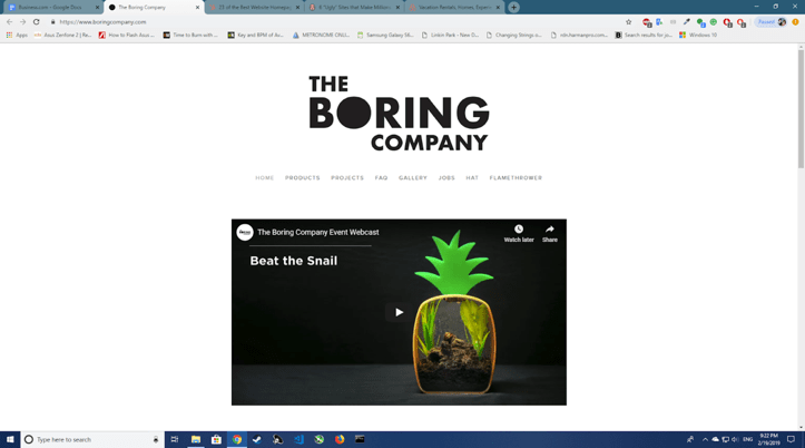
Starting your conversation with your audience through a video is the best thing that you could do. Period. But what video? How should it be designed and presented? Check out Elon Musk’s The Boring Company for inspiration. The company plans to use tunneling to approach traffic problems, and this is how it effectively conveys its purpose.
- The entire home page is an intriguing spectacle. It has the logo, which stands out against the stark, white background, only broken by the presence of one video. If you can make your audience’s mind go numb, do it.
- What does the video depict? Well, exactly what the company does, in a very engaging manner. The website’s FAQ page also satisfies any curiosity that you may have by tackling the bull by the horns.
- The element that stands out most on this website is the sore lack of elements. Don’t add unnecessary, unfunctional elements if they aren’t adding any value.
3. Samsung

One can’t have a conversation about technology and design without bringing up Samsung. The mobile device company has a website that sets it apart from other such companies in its space. It’s not only focused and minimalistic but also interactive. And the first thing that you want to do when optimizing your website is to make it interactive.
- Whitespace is a weapon to gather viewer attention. Notice how Samsung uses its whitespace to draw attention first to the main banner - with highlights - and then videos of its latest product. White space can be powerful when leveraged properly.
- A global giant like Samsung doesn’t have to make its website interaction. But by setting-up a chatbot at the bottom, the company is making the Samsung experience, even more, engaging for fans and customers.
Using a chatbot like Acquire, you can set-up a chatbot, live video calling and cobrowsing on your website to increase customer interaction.
- Note (pun intended) how Samsung uses native coloring on CTA buttons to make them more impactful? For ages, brands have been using loud and extra colorful buttons to catch attention. Well, guess what? Today’s audience is wary of that tactic and tends to ignore loud buttons subconsciously.
4. Evernote
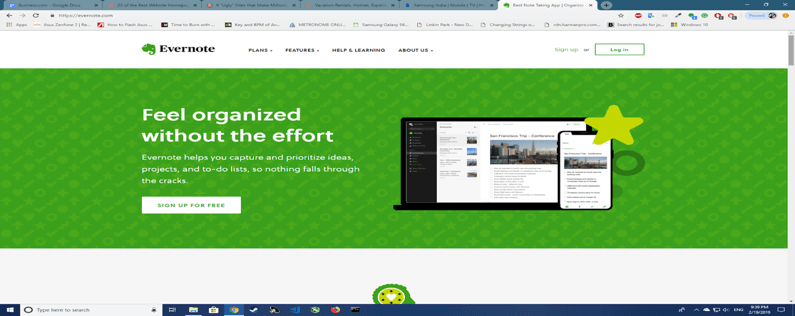
Over the years, Evernote has expanded from being a note-taking app to offering a wide suite of business products. As you can expect, this isn’t likely easy to convey on a webpage. Which product would you focus on? How would you tie them all together without diluting the allure of your Call to Action? These are the questions that may have haunted the Evernote marketer before he or she arrived at these solutions.
- Focus on the value you’re selling instead of the product. Note (pun overused) how Evernote’s unique value simply reads feel organized without the effort. Now, before you apply this to your website, ensure that the effort goes in hand with your brand-building so people will know your product is a notepad.
- Evernote’s website features its signature green color, that you can clearly recall from its elephant icon logo. Color schemes are essential in website optimization to enable brand recognition and recall.
- Evernote’s CTA has been ‘Sign up for free’ for as long as I can remember. This is an optimized CTA that probably rewards the company with the most sign-ups. You can rest a few over a period of time to determine which one to settle on.
5. Seth Godin’s blog
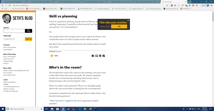
To be clear, your website could entirely be content-based and still succeed. If you have irreplaceable content, you don't need great design to back it up. Take Seth Godin’s blog for instance. Yes, he does follow certain websites optimization rules such as minimalism and use of white space, but for the most - it’s an organized storehouse of great insights. Nonetheless, here’s what one can learn from this website.
- Your website should mirror your brand’s personality. Seth Godin is all value, no fluff. His website is accordingly the opposite of pretentious and has only the essentials that you’d search for on it.
- Even if your website is simple, you need to choose a color scheme and stick to it. Seth Godin’s website has remained more or less the same since 2003. He has always designed website and blog elements using his signature yellow and an almost consistent photograph of his.
- Note how even his Cookie Disclaimer is neat and blunt, in character with the rest of his website. If you want to build a long term relationship with your audience, you have to be consistent.
Bonus website optimization tips ( a refresher of the basics)
- Make the website easy to navigate.
- Increase website loading speed.
- Use clear images of optimum definition.
- Ensure that you have enough white space.
- Focus on finding the right CTA.
- Rid your website of broken links and missing images.
- Use humor to ease rough edges (start with a funny 404 page).
- Load your website with free, truly useful resources.
- Include social proof (case-studies, customer testimonials).
- Keep it simple. Don’t get too complex.
If you’re looking for one way to increase your business in 2019, try focusing on website optimization. If you optimize your website for conversions, you can collect more leads, drive more sales and build lasting relationships with your customers. Remember, all you need is a little inspiration and the right optimization strategies. So, what are you waiting for? Get started right away.